Pages

Showing posts with label embellishments. Show all posts

Saturday, August 4, 2012

Let me make it up to you

Sorry for the long absence.  Life happened.

To make up for the almost month away, I will post ALL of the goodies in my "to be posted" stash.

First up is the latest card I have completed for my Open Swappers Group.  Click HERE for more information on joining the group and to see what the other swappers created.


Supplies:
Stamp set: Pleasant Poppies
Card stock: Whisper White and Poppy Parade (retired)
Inks: Poppy Parade (retired), Daffodil Delight, Certainly Celery
Accessories and Tools: Certainly Celery 1/4" grosgrain ribbon (retired), Brights brads, and Simply Scored tool.

I used the new Pleasant Poppies large background stamp.  This is really an easy card.  I water colored the poppies using and aqua painter.  I did not worry about staying in the lines because I wanted a very soft look.  The scored line on the top and the bottom just adds a hint of interest to the card.

Project number 2:  I made this for my friend.  She just moved into a new home and is moving on in her life after a marriage ending.  This is her time to bloom, so I made this to remind her of that.  The colors match the colors she has chosen for her new master bedroom.


A closer look at one of the "Hydrangea" blooms.  I used the Trio Flower punch (retired) and sponged each flower in  Perfect Plum.  There are over 1,000 flowers on the two blooms!  This took me longer than I planned and left me with purple fingers.  The butterfly is from a big box store and just matched! It so fits in with the idea of rebirth.  I used straight pins to push the flowers into a Styrofoam ball.  Another reason for purple fingers.  After pushing in over 1,000 pins, the pad on my thumb had a bruise!  The idea for the project came from a catalog of another stamping company.


Supplies:
Sizzix Timeless Type Alphabet Die
Card stock:  Whisper white, Elegant Eggplant, Certainly Celery
Inks: Perfect Plum, Elegant Eggplant
Trio Flower Punch (retired)
Certainly Celery 1/8" taffeta ribbon (retired)
Candlesticks and Styrofoam balls

Project 3:  Sometimes giving a tip in a nice little envelope is cool.   These are made from the Scallop Envelope Die.  Add an appropriate label and they're ready to use. 

Supplies:
Stamps: Perfect Punches (retired)
Ink: Pear Pizzazz
Bigz Scallop Envelope Die
Card stock: Whisper white
DSP: Berry Blossoms (retired)
Pear Pizzazz 1/4" organza ribbon (retired SAB)
Punches: Scallop oval, Moder label

I punched a hole in the center of the flap and brought the ribbon up through it to tie the bow.  Keeps the flap closed and gives it a finishing touch.

Project 4:  These are the thank you cards for orders placed last month.  I really love the Mixed Bunch stamp set. 


Supplies:
Stamp Set: Mixed Bunch, Loving Thoughts
Card stock: Whisper White
Inks: Summer Starfruit, Primrose Petal, Gumball Green
Adorning Accents Embossing Folder
Punches: Blossom, 1" circle
Basic Rhinestone

Project 5:  This card is a CASE of a card made by Mary Brown.  I love her style.  This was a card from a workshop that I had.  The clouds are made from the cupcake builder punch!  My downline made a card using the punch as a cloud and I adored the idea!


Supplies:
Stamp Set: Up, Up and Away, Friendly Phrases
Card stock: Whisper White, Bashful Blue, Marina Mist
Inks: Midnight Muse, Basic Black, Raspberry Ripple, Pumpkin Pie
Punches: Build a Cupcake
Polka Dot Embossing Folder 


Project 6:  This was another card made at the same workshop as the balloon card.  It has a special gift card holder!  The idea for the card came from a convention swap last year.  There was no name on the swap, so I have no idea who to give credit to for the design.


See how the ribbon pulls out the gift card holder?!  Clever eh?


Supplies:
Stamp set: Betsy's Blooms Wheel (on the gift card at the bottom)
Framed Tulips Embossing Folder
Card stock: Rich Razzleberry, Daffodil Delight, Baja Breeze, and copy paper for the envelope
DSP: Floral District
Inks: Rich Razzleberry
In Color Designer Series brads
1" circle punch
Daffodil Delight Seam Binding Ribbon


Final share:  This is a birthday card I did for a friend.  This is also a CASE of Mary Brown.  Told ya I love her stuff! 


I have been working on this post for most of the day.  Having my family home is wonderful, but it is difficult to get anything done!  The minute I sit down, another interruption. I know any mom out there can relate. 

Thanks for visiting.  It is appreciated.

Kristine

Monday, July 2, 2012

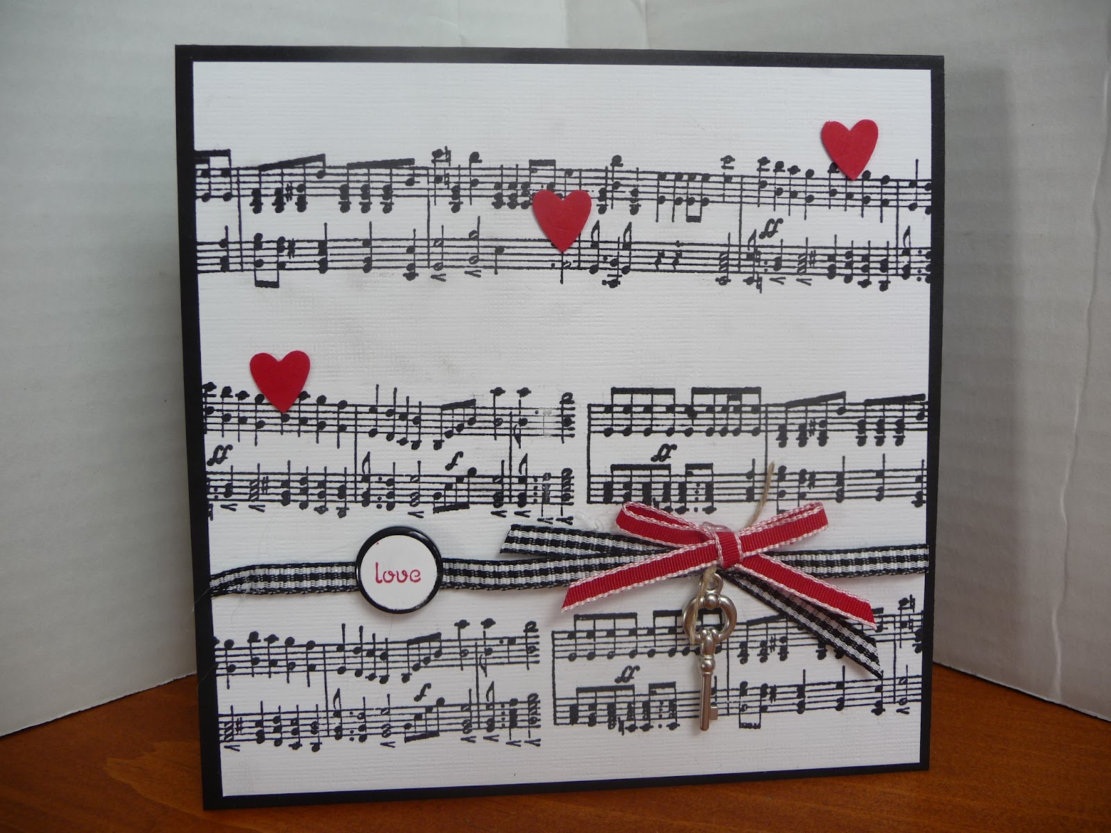
A love note

Do you get it?  Love notes! HA! The key is the key to the card giver's heart.  Ahhhh...

This card did not come out the way I originally intended, but...well, sometimes a person needs finish what one begins.  The thing that happened with this card was that the black ink was smudging.  It is the new Stampin Up classic ink.  I love that it is black-black, not purple-black. But I was not lovin' that it was smudgin'. It should dry quickly.  Obviously on the textured white cardstock it needed more time. 

I wonder what the music sounds like if the notes were to be played?  It looks like it would be fast. 


This card was for a swap.  I kept the least attractive card for myself.  If you want to see what the other swappers made, click HERE.

Thanks for the stop in.
Kristine

Monday, June 25, 2012

Some cute gifts

One of the things I like to do is create some hand made gifts for workshop attendees.  Here is the gift I made for the last workshop.


Even if I do say so myself, these potted flowers are cute, cute, cute!  The idea is not my own.  I found this tutorial on a blog that has a wide variety of ideas called The Diary of Two Crafty Girls. Isn't that a cleaver blog name?  This tutorial is from Natasha and she made it easy peasy to do.  Go to their blog and search Flower Pot Gift Idea tutorial.  I used the stamp set Fabulous Florets, just like Natasha did in her sample. The colors of the blooms are the new Summer Starfruit and Primerose Petals.  The leaves are the new Gumball Green.  See, a showing of the new In Colors! Ahh, I may be a wee bit clever/crafty too! 

Gasp!  I just noticed that I took a picture of the BACK side of the pot!  The front is the same, but has the raffia ribbon bow.  I do not have another to take a picture of!  {sigh}  Oh, what to do with a middle-aged mind.   Ah well, we will all pretend that the picture has a bow.  Anyway, the original idea was to put a bulb in the little pot.  But the workshop was postponed past bulb planting time, so I did the next best thing and filled the little pots with candy! (Maybe the ladies liked the candy more than they would have the bulb?  It's that instant gratification thing.  Yummy candy now vs. a flower in three months.)

Here's a peek at the inside.  Hey!  You can see the bow on the front!  See, I'm not fibbin'  about the ribbon!  That rhymes...fibbin' and ribbon.  Onward...

And here is the box waiting to go to the workshop. Happy little box!


I had another special gift for my hostess.  Some yummies inside this as well. :-)  The flower is what I want to share.  I made it using the Paper Daisies.  One daisy as a bottom and then folding the daisies into forths and hot gluing them to the base until you have the fullness you want.  I spong daubered this with Primrose Petals Ink and swipped the edges with Bravo Burgandy ink.  A Basic Rhinestone in the center adds some sparkle. 

I think it kinda looks like a carnation?  The box is made from the retired Bigz XL Box #2 Die in Bravo Burgandy Textured cardstock.  White taffeta ribbon to wrap around.


There you have it!  Some gift presentation ideas.  Thanks to all of you for giving of your time today. I wish you a pot full of candies!

Kristine
Sunday, April 29, 2012

I've lost it

Somewhere out there is my mojo.  It certainly is not with me.  Mary Fish has designed a wonderful Mojo Monday sketch (#238), and yet I have worked and fiddled and started over and ... well, judge for yourself.


Supplies:  Wow Flowers
Card stock: Green Galore, Whisper White
Designer paper: Rainbw Sherbert
Big Shot Die: Flower, Daisies #2
Apricot brad and ribbon


{sigh}  You know what I would like?  Someone to tell me where this card went wrong.  I have not even peeked at the other Mojo enteries.  Maybe I'll know what is wrong when I see the other entries? Olivia likes it.  Maybe it is a tween card?  

Here's the sketch:
I cannot get the Mojo sketch picture to stay in the place I want it on my blog.  Ay yi yi...I should head back to bed.

Thanks for stopping in. 
Kristine

Tuesday, April 24, 2012

Sunshine

Today Reno is overcast, but warm.  I would love a downpour with maybe some thunder grumbles.  There is nothing better, to this native Reno girl, than a spring downpour leaving the soil smelling like nothing else, except maybe Heaven.  I have smelled rain in lots of places around the world, but nothing compares to the smell of rain in Northern Nevada.  I am biased, I realize, as this is my home. :-)  But the card I made today has nothing to do with rain.  It is all about the sunshine!


Supplies:
Stamps: Button Buddies, Pursuit of Happiness
Card stock: soft Suede, Old Olive, Daffodil Delight
DSP: Attic Boutique
Embellishments: Neutral buttons, Lucky Limade Bakers Twine, Brights brads
Dies: Top Note

For those of you who have received the free Button Buddies card kits, (see the link at the top of the page for card kits if you're curious) here is an example of one more card you can make with the Button Buddies stamp set.  I stamped the flower three times--once in Old Olive and twice in Daffodil Delight.  I then fussy cut them out by layers and popped each layer up on a dimensional.


  It is not visible in the picture, but I also painted each leaf and petal of the flower with the Smooch Pearlized Top Coat paint.  So when you move the card, the flower sparkles. A little sparkle is always nice.  The layout is from a card sketch designed by Lisa Hjulberg for Taylored Expressions sketch challenge 144.

One more share...
Another thing I enjoy about Spring in Northern Nevada are the blossoming trees.  They line the parkways, they peek out of yards, and they smell almost as wonderful as the rain.  My kids tease me because I think fruitless plum trees smell like tacos.  They do!  Flour-shelled tacos.  I call them taco trees.  The blossoms pictured below are from the cherry tree in my back yard.  The tree is loaded with blossoms.  The bees are busy doing the things busy bees do, and I am crossing my fingers for another bumper load of pie cherries come late July. Last year we had over 20 gallons of pie cherries off this tree--and that was with sharing with the birds.  They ate from the top branches, we gathered from the bottom branches.   At dusk, this tree looks almost glowing.  It's white is pristine and stunning against the oranges of the sky.  My favorite place to gaze all spring.


Thanks for sharing some time with me today.  A special welcome to a new follower, Samara.  Thanks to all of my subscribers and followers.

Kristine  

Sunday, January 8, 2012

Two shares

Long time no see!  So glad that you did not give up on me and came back for a visit.  Thanks!

Today I have two cards to share with you.  Both of them use the same color scheme, but have decidedly different feels--at least I think so.  The paper is a sneak peek at some of the DSP that you can receive FREE during the upcoming Sale-a-bration period, January 24th through March 31st.  I am telling you this...I LOVE this DSP. 

Here is the first card...


This card also uses the Enchantment Ribbon in Calypso Corral that you can receive free during Sale-abration.  I love the colors of Pool Party and Calypso Corral together.  Who'd a thunk?  Not my usual color combo.  But I was lead by the DSP.  See the Corral pearls?  Wanna know how I made those?  Simple!  Take our Basic Pearls and an orange Sharpie pen and color the pearls.  It is almost a perfect match for the Calypso Corral!  I was so excited when that happened. You, as a crafter, will understand the excitement.  My family, however, was non-plussed by the incredible luck of it.

There is something else I used that is pretty cool, but may not seem so at first glance.  The sentiment in this card is a retired set Friendly words.  But guess what! It is available in My Digital Studio (MDS) and can be made ANY size you want in that program.  Too cool.  So I used MDS to print out the sentiment in Calypso Corral (bigger than what it is in the real life stamp set) and then stamped the banner from the Occasions set Take it to Heart around the printed words. (Easy to do with a clear mount set.)  I cut the banner out and popped it up on dimentionals.  Take a look at the MDS.  The program is a wonderful tool for so many reasons. One of the coolest things about buying a download for MDS is that the brush sets, the DSP, the embellishments NEVER retire!  Never.  Nope, not even on December 21, 2012 when the Mayan calendar ends.  They will still be available. :-)  Finally, the heart is one of the images in the Take it to Heart set.  I wanted to highlight one of the images that might go unnoticed.  It is a very elegant little heart.


The second card...


Isn't this a simple layout?  This was my thank you card for December orders.  I had a bunch to make (Thank you again everyone who bought in December!) and these were the perfect answer.  I have used the same DSP as in the above card.  Guess I'm just drawn to this one, huh?  The stamp set is Funky Four and the sentiment from Trendy Trees. 


Thanks for looking at my creations.  You're the best!

Kristine

Thursday, October 6, 2011

The last of summer

There are snow flurries today in Reno.  Crazy weather.  It is truly fall.  In honor of summer fading, I made a last summery card for my Open Swappers group.  I used a set that I bought because I think the images are serene and beautiful.  It's called Plant Hope. That is a good directive too...plant some hope somewhere.  Maybe someone's heart, maybe in your own heart.  Here's the card.

Stamp: Plant Hope, Line Background, French Script
Paper: Crumb Cake, Barely Banana, Mellow Moss, Always Artichoke, Very Vanilla

This is a CASE card from an older SU IBC.  I used almost all retired items on this card.  The nifty thing about my group, the Open Swappers, is we can use retired items.  We are "Open" to using ANY SU merchandise whether it be brand, spankin' new, or from the first years of the company's production.  There's no themes mandated, no musts.  It is for pure fun and enjoyment.  Use what ya want 'cause you want to use it! 

To see what the other members of the group designed, click on the picture of the white Alpaca on the right sidebar.  If you would like to join in the swap, send me an email and I'll get you the details of the swapping.

Thanks for stopping in.
Kristine


Sunday, June 19, 2011

A little Mojo

Happy Father's Day!  As happens every once in a few years, today also happens to be my birthday.  I turn 22 (cough, cough) today! Actually, I am 44 today and glad to be 44 rather than 22.

I have been working on my convention swaps today.  I have one to share!  It is based on the Mojo Monday sketch #195. It uses two new hostess sets from the upcoming 2011-12 Stampin Up catalog called Posy Punch and Perfect Words.  The Posy Punch works with the Fancy Flower Punch.  So easy peasy to punch out those posies!  I made a boat load of these.  But, you know what, there are a stinkin' lot of pieces to this card!!  Took me forever and a day to get them all assembled!  Two pieces ran through the Big Shot to be embossed, lots of sponging...I kill myself with work sometimes! But, I get that bee in my bonnet and stubbornly keep with the original plan to make a boat load to swap. 


I can't see the sponging in the picture? The middle circles are sponged as are the rims of the posies. The sentiment flag is also sponged. (They say a picture is worth a thousand words.  Some of the words in this picture are missing since the picture is not clearly representing real life!) The leaves are actually the wings on the bird from the 2-step bird punch.  Love making the easy leaves.  Lots of gold brads too.  Six per swap!!  But I just likey the way they looky, so no changey, changey! 


Recipe:
Stamps: Perfect Words and Posy Punch (hostess sets from new catalog)
Embossing: Pattern 2 from the Perfect Details Texture Plate, Polka Dot EMF
Ink: Baja Breeze, So Saffron, Pear Pizzazz
Card stock: Very Vanilla, Baja Breeze, So Saffron, Pear Pizzazz
Punches: Fancy Flower, 3/4" circle, 2-step bird, Eyelet border
Accessories: Gold brads, Victoria Crochet Ribbon

Thanks for stopping by. I appreciate it!
Kristine


Wednesday, May 18, 2011

On the Grow and waiting for warmer weather

Did I not get the memo?  Isn't it Spring?  It's cold and raining in Reno. {sigh}  I love rain.  Hate wind and cold.  But...I am cozy in my home playing with paper and stamps.  I can see the wind and the rain, but my heater kicks on, I sip on my tea, and life is good. :-)

Hmmmm?  You came to see a card?  Ohhhh!  Yes, I have one for you. Look!


I made this card for a friend.  (Hi Rhonda!) When Stampin' Up! went through their color renovations, most of the purples said goodbye.  This card uses the retired color Lavender Lace.  This is one of the purples that I did use often.  Alas, my stock of Lavender Lace card stock is dwindling.  But...who the heck knows...maybe a new color in July will be a kissing cousin of Lavender Lace?  Oh! That makes me smile.  The Stamp is from the new Summer Mini Catalog (you can take a peek at the catalog by clicking on its picture in the right-hand sidebar) called On the Grow.  It has that wonderful scooter too.  Notice the sparkle in the center of the flowers?  Those sparkles are the handy work of the tiny Basic Rhinestones.  Purdy.  The placement of the Silver Hodgepodge was serendipitous.  I placed it down and just liked where it landed! 

So, I must leave blog land and go back to preping for my "Onderful" One Layer Class being held this Saturday.  It a challenge to create cards using only ONE layer of card stock.  I know that vintage is "in" right now, and I'm bucking the crafting trend, but that's the rebel in me. ;-)  I run with scissor too.  Wild woman! I'd show you the cards, but I always like the class participants to get first gander at the projects.  I promise; you'll see my work soon!  If you would like to know when I hold classes or camps, drop me an email and I can put you on my newsletter list. 

Okay...off I go. Enjoy the rest of your day.  Stay dry!
Kristine

Wednesday, May 4, 2011

Two ribbon tricks!

Today's cards both use ribbon.  I have a trick to share with you for each.

Number one is a card that mimics a store front window.  I'd like this store since it sells cupcakes!  For awhile, I saw awnings on cards.  Haven't seen any lately, but I wanted to give it a try.  I think it's cute! I used the Word Window Punch to create the stripes.  Simply punch and adhere to a strip of cardstock.  Fold the ends in opposite directions and adhere to your project.


This card qualifies as a punch art card.  The only stamping on the card is the sentiment, from the set in the last Occasion Mini Bring on the Cake.  That set is no longer available, but I'm a hopin' that it makes it into the new 2011-12 Main Idea Book and Catalog coming out in July.  It's a great set.  I hope you purchased it!  If not, cross your fingers along with me for the July release of the new catalog!  I did offer Glimmer paper to the ladies at the workshop, but my sample has just basic Real Read hearts and cherry.  I used the Cupcake Punch to make the cupcakes (uhhh, yeah duh Kristine).  The paper wrappers of the cupcakes are crimped using the Paper Crimper.  Just crimp a strip of paper before you punch it with the Cupcake punch.  Super easy.  I think this is the kind of card that has a wow effect, but really is simple to put together.  The bow is a "Stay Put Bow" taught to me by a wonderful demonstrator, Mary Fish. 

Here is a picture tutorial for the stay put bow.  It really is simple and keeps your bow from loosening and sliding off the project.  First, place a hole in your cardstock where you want the bow to be.  I have punched a 1/8" hole.


Take your ribbon and pull both ends from the back to the front side of the project.


Take the loop hanging from the back and bring it around the sides of the project to the front.


Pull the two ends tight and place one end on each side of the ribbon you looped around.  No need for someone else's finger.  You can now easily tie the two ends!


I did a simple knot and then trimmed the ends!  Waalaaa!!


The next card is striking in its simplicity. 


The card is a CASE from my upline Linda Gutierrez   She made a bunch of samples using the Four Frames Stamp set and the DSP Paisley Petals.  These two items are not available right now, but will be in the new catalog. (They were a promotion in April)

 I want to show you how to make the bow on this card without having a HUGE lump due to a knot.  The larger ribbon can be hard to use for this reason.  I never want a huge knot, and bows can be ginormous with 1 1/4" ribbon!  So, here's what I did.  First, wrap the ribbon around the card to get the length you want.


Next, figure out how long a ribbon "tail" you want and snip a hole into the center of the ribbon.  I gave myself  about 2" from the end before I snipped.  This is a small snip.  Don't get all crazy and make a big hole! :-)


Now, pull the other end of the ribbon through the small hole.


I used an Antique Brad on this card, so I opened the brad's legs and wrapped them around the ribbon.  (Is it just me, or did that last sentence sound...ummm...naughty?) Trim the ends of the ribbon, and another Waaa laaaa!!!


  It's not bulky at all! You could even mail this!

Well, thanks folks for stopping in.  I hope you find a opportunity to do a ribbon trick or two! 
Kristine


Tuesday, March 29, 2011

Fungi for a fun guy

This is the second card that I had as a project at the Sale-a-Bration event this past March 19th.  It is a rather bold and bright card.  As a demonstrator, I feel that my customers should be able to see all of the colors used...not just my favorites! :-)  So I will, typically, at every event or workshop go in search of a card design that is something different than one I would design and add that card into the mix of what we will be making.  I found this card design on the Stampin' Up demonstrator website where all of the demos can upload photos and "steal" ideas from one another. Ilina Crouse is the demo who posted a card similar to this one.  I didn't have the exact DSP she used, but the idea/layout and stamp set are the same.   I think it such a cute card! 

. 

A couple of things this card has that sold me...
1.  It uses turquoise...an often left out color in my cards.
2.  It could be used for either a male or female.  If it is for a male, on the inside of the card you can write a message that says something like, "You're such a fungi!" A horrible play on the words "Fun guy."  Men like those kind of puns...at least the men I know.  Baffles me.
3.  It showcases stamping with markers.
4.  Just by switching the DSP over and using a different image in the Funky Four Stamp set, you get a more feminine feel card with more muted colors.  See...

Stamps: funky four, Cute and curly
Card stock: So Saffron, Chocolate chip, Whisper white, Old olive, Play date Designer Paper
Inks: Old olive marker, Crumb cake marker, chocolate chip marker, So saffron marker, Tempting turquoise marker
Punches: Ribbon border, 1/16" handheld circle
Accessories: Subtles collection brads

The only bad thing about this card is the number of layers.  You can be sure I was grinding my teeth as I preped for the event.  80 card kits cut.  Each card has 12 pieces. (Two are hidden on the inside)  Do the math.  That is a gazillion pieces of card stock cut! But my cutter and I both held up!  We're both troopers.

Thanks for stopping in.  Next time you need to do more of the talking.  (ha! crack myself up!)
Kristine

Tuesday, March 1, 2011

Howdy!


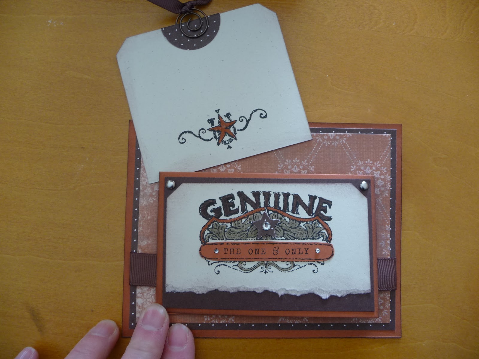
I love this card I designed.  Is that bragging?  It is really rare that I create something that knocks my own socks off.  I have been on a kick with small cards attached to larger ones, and this uses that same idea.  The whole card is just different.  I think it could work for a male or female as well. Okay, take a peek and then I'll give you some specifics.


edited to add suplly list since a few have asked! :-)
Stamp set: Bronc Buster, Afterthoughts (hostess from this catalog)
Inks: Stazon black, chocolate chip
Markers: Crumb cake, really rust, chocolate chip
Punches: Ticket corner, word window, star, 1 1/4 circle
Paper: Really rust, chocolate chip, natural ivory
DSP: Bella Rose, Simply scrappin kit Round up
Ribbon: 5/8" grossgrain chocolate chip, 1/4" grossgrain chocolate chip
Accessories: sponge, silver brads, aged copper hodgepodge hardware, basic rhinestones, dimensionals


This card is for a swap I do with other ladies using whatever SU supplies we have.  It is so much fun to get the swaps in the mail.  I am swapping with some talented ladies, and the fact that the items do not need to be current really opens up the surprises.  The set I used here is a retired set called Bronco Buster.  I really like western stuff.  The main card stock is Really Rust. Complementary colors are Chocolate Chip and Natural Ivory.  The details behind the star are colored with a Crumb Cake Marker, Chocolate Chip Marker and Really Rust Marker.  It is hard to see in the picture, but there is also some Chocolate chip sponging around all of the card stock edges.  A few Basic Rhinestones and the card just sparkles! See the tab at the top of the square?  It has the ribbon pull.  This is what is pulled out from behind the mini card.


Cute little place to write a note!  If a person wrote enough nice stuff on the tag, the recipient may end up using it as a book mark!  And finally the inside of the little card (which measures 5 1/2 x 4 1/4).


I used some retired Hodgepodge with the buckle and the spiral on the tag.  I just love the buckle on the inside!  The main piece of 5 1/2 x 4 1/4 Really Rust card stock does not open.  See!  A very different card!

Okay, now I need to find those socks I knocked off myself. :-)

Have a great day.  Thanks for sharing some of your time.  
Kristine 

Wednesday, January 19, 2011

Product of play

Amazingly, recently I had some time to sit and play with my schtuff.  This is the card that was produced out of that play.  I used the designer paper Lap of Luxury which has a Pretty in pink sheet with the words, Life is Beautiful in this glorious script.  I wanted to use the paper, but I didn't want the card to be pink.  Oh what to do?  So, I stamped the Medallion background stamp in Versamark onto the DSP.  Then I embossed using clear embossing powder.  THEN...oh then, I brayered Basic Gray ink over the DSP.  Waalaa!  Not so much pink!  The DSP when heated turned more of a blush color.  I likie!  I wiped the gray ink off of the medallion (the embossing powder lets you wipe off the ink and lets the words show through.  It's magic!)
I added some Basic Pearls around the center of the Medallion and larger ones down the side.  And of course one in the very center of the Medallion.  Some Gray Satin Ribbon adhered in a wave of glory and a Styled Silver Hodgepodge piece adds some class.  The sentiment is from a set out of the Occasions Mini Catalog called You're a Gem.  I used this same set on my last project too.  I thought the script of the E in "enjoy" was so similar to the script of the DSP.  Do ya think SU did that on purpose? Hmmm.


Next are the cards that my club made for January.  They are wonderful, no?  YES!  I cannot take any of the credit for their design.  Mary Fish is the creator of all three cards.  So pretty, clean and simple.  Valentines is not my favorite holiday.  I'll eat the chocolate that is in abundant supply around Valentines, but the rest of the holiday leaves me feeling...ehhhhh.  Even with all that said, I really liked these cards.  So I had my club make them!  The card with the trio of flowers could easily be made into a birthday card.  Just switch out the sentiment.  My favorite thing about all of the cards is the scrunched ribbon on the bottom card.  Love it, baby!  The bottom card is actually a "clear" card, meaning that the main card is made from mid weight Window sheets.  Very cool.  All of the stamps are from the Filled with Love set available until January 24th as a Promotion from SU.  I made 36 cards from the paper that comes in the bundle, and I still have three FULL sheets left!!  That's a heck of a good deal. If you would like to purchase the Filled with Love Bundle, which comes with free Bitty Buttons, shoot me an email.  I can help you order what you need.

It's time to sign off.  I have other projects to share, but they will have to post next time. 
Take care, be kind to yourself, and smile.

Kristine

Tuesday, January 4, 2011

My hand at a vintage look

The New Year has started, and I can feel it in my bones that it's going to be a good year.  So far each day in 2011 has brought me a little, nice surprise.  What fun!

For this week's card, I was going for a vintage look.  You know, vintage is all the rage.  But I am a pretty simple girl who goes more for the clean lines.  BUT, I thought I'd give it a try.  I don't think I made my goal of a vintage look (other than the distressing of the card stock), but I do like the way it turned out.  The stamp set is one of my favorites, Friends 24-7.  I like the Fleur-de-lis in the set.  As you can see, I used that as my background.  The little tag hanging off the ribbon is stamped with a sentiment from a new set in the Occasions Mini catalog called You're a Gem.  I like phrase sets.  I tell ya, this Occasions mini is packed full of things I want.  I am really having to hold myself back from breaking the bank buying everything on my wish list!  Anyone know where the line is drawn between something being a hobby and when it becomes an addiction? :-)

Have a lookie:


It's hard to see in the picture (geesh, when will my photography improve?) but there are "smudges" of ink on the background as well as on the vanilla floral piece.  I used the Crumb Cake Seam Binding Ribbon which has a light feel to it.  It reminds me of the kind of ribbon I used to find in my grandma's sewing basket.  The card stock I used is Soft Suede and Pear Pizzaz.  There are also mini Basic Pearls in the flower centers.  Me likee. You know what would have made this card more vintage?  More schtuff.  Ahh well, not vintage, but I like it.  :-)

Thanks for popping in.
Kristine

Wednesday, December 29, 2010

Finishing up the year

I have a couple of projects to share with you from the past month.  I have been creating, but not blogging.  I'd make a New Year's Resolution about blogging more often, but that resolution may go the way of many and not be realized.  So I won't make the resolution! lol 

I hope you have a wonderful New Year with lots of fun and time to do the things you love most.  Enjoy the following posts. 


A card I made to send to the troops.  I made a bunch of these so that they could be sent to the troops and the troops would have time to receive them and then be able to send them back home to a loved one for Valentines.  This was a challenge made by Gretchen Barron on her blog.  The card design is a CAS of Rhonda Beadell.


Next, a gift using DSP on letters from Joanne's.  Of course I had to bling them up just a tad.


Exploding gift boxes.  These boxes use just one sheet of 8.5x11 card stock plus DSP or stickers as you desire.  These are filled with chocolate. :-)


My first ever Hanukkah card made for my friend Dan. 


A little bitty lantern.  Soooo cute.  The idea came from a fellow demonstrator (and very nice person I might add) Laura Lipe.  I changed mine up a bit from hers.  This was a club project for December.  Inside is a flame-less tea light. 


Another December club project.  Chocolate Ghirardelli squares are always a great gift, but when presented in this decorative box...well they become just a little more special, yes?


And the final club project for December was punch art gift tags.