Pages

Showing posts with label Bling. Show all posts

Monday, April 2, 2012

My not so little loveys

March is over.  March for me is birthday month.  Both of my children were born in March.  Always makes for a busy month.  My son, Thomas, just turned 14 (gasp!) and my daughter, Olivia, just turned 12.  Where did those years go, I ask you??  I feel that since I have still not lost the "baby weight" it is unfair of the child to grow up! :-)  But grow up they have.  Thomas is 6'.  He shall be a big, strapping man.  Knew that at his birth! Lordy! He was 10 pounds at birth.  I never got the chance to put him in the cute newbie clothes.  He came out ready for 2 month clothing!  Livi, on the other hand, is as dainty as you please.  She was a 9 pound, chubby, sweet smelling, rolly polly at birth, but she is so dainty now.  One of my favorite things to do on laundry day is look at her clothes.  (Shhh, don't tell her I get all sentimental over her clothes) Her clothes are... well, hate to repeat myself, but...dainty. 

Anyway, I made them cards for their special days.  I got all sentimental in what I wrote inside, and basically did the "Mom thing."  Who knew I would turn into my own mom and cry at the drop of a hat?  Sorry Mom for rolling my eyes when you cried when I was younger.  Didn't get it.  Got it now. 

They asked if I was going to put their cards up on my blog.  I asked if they wanted me to.  They asked if I wanted to.  I said...well anyway...long story shorter...here they are:

Thomas' card:


Thomas has always been into animals.  Eagles and wolves in particular.  And the sentiment...so true.  He DOES inspire me.  Leaves me in awe.  Leaves me speechless (in a good way), and I could not be more proud of the man he is becoming.  (Hang on, I need a hanky.)  Question:  That smudge above the eagle was not there when I gave him the card.  I do not remember seeing it when taking the photo.  Where'd it come from?  Hmmm. Let's pretend it's not there!


Olivia's card:


Livi is my sparkle girl.  Or "sparkletastic" as she would say. :-) We are in the process of painting her room. (Please do not ask me how long we have been " in the process." )   Pool party is a pretty close match to the color she picked.  Livi stamps with me frequently.  She has a wonderful sense of fun and color to the cards she designs.  Me, well a little more understated.  I tried to bling it up for her.  She was pleased.  Made me cry.  Olivia is what I call an old soul.  She is wise beyond her years, her humor is sharp, but kind, and her advice...better than Dr Phil's.  Swear!  When I get all muddled up in "Life," she can make things simple for me.  She knows how to get to the point.  I admire her.  I want to be her when I grow up. (Where's that hanky?!)

Yes, the Lord blessed me with my children.  Noted, by me, every day.

Thanks for stopping by.  I would be grateful for you if you want to sign up as a follower of this blog.

Now, I'm going to go kiss my kids.  They're sleeping, but I'm a gonna kiss 'em anyway!

Kristine


Tuesday, March 1, 2011

Howdy!


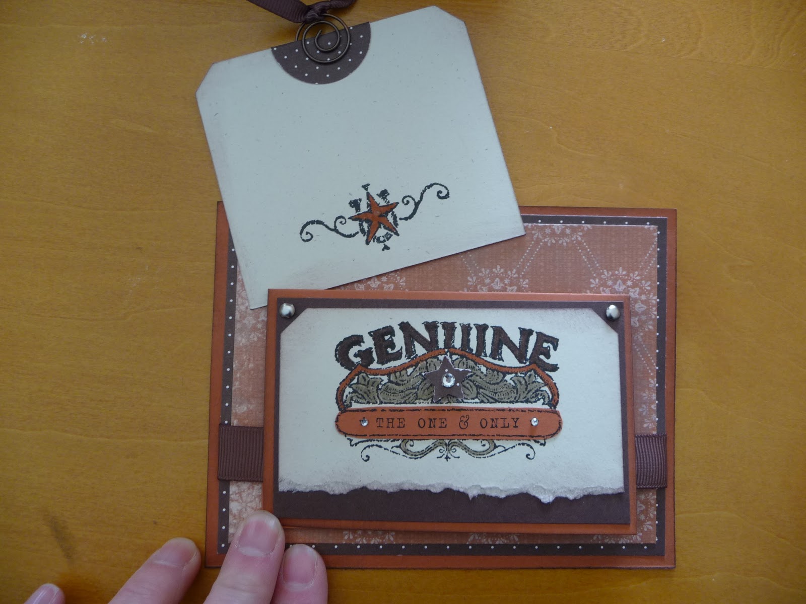
I love this card I designed.  Is that bragging?  It is really rare that I create something that knocks my own socks off.  I have been on a kick with small cards attached to larger ones, and this uses that same idea.  The whole card is just different.  I think it could work for a male or female as well. Okay, take a peek and then I'll give you some specifics.


edited to add suplly list since a few have asked! :-)
Stamp set: Bronc Buster, Afterthoughts (hostess from this catalog)
Inks: Stazon black, chocolate chip
Markers: Crumb cake, really rust, chocolate chip
Punches: Ticket corner, word window, star, 1 1/4 circle
Paper: Really rust, chocolate chip, natural ivory
DSP: Bella Rose, Simply scrappin kit Round up
Ribbon: 5/8" grossgrain chocolate chip, 1/4" grossgrain chocolate chip
Accessories: sponge, silver brads, aged copper hodgepodge hardware, basic rhinestones, dimensionals


This card is for a swap I do with other ladies using whatever SU supplies we have.  It is so much fun to get the swaps in the mail.  I am swapping with some talented ladies, and the fact that the items do not need to be current really opens up the surprises.  The set I used here is a retired set called Bronco Buster.  I really like western stuff.  The main card stock is Really Rust. Complementary colors are Chocolate Chip and Natural Ivory.  The details behind the star are colored with a Crumb Cake Marker, Chocolate Chip Marker and Really Rust Marker.  It is hard to see in the picture, but there is also some Chocolate chip sponging around all of the card stock edges.  A few Basic Rhinestones and the card just sparkles! See the tab at the top of the square?  It has the ribbon pull.  This is what is pulled out from behind the mini card.


Cute little place to write a note!  If a person wrote enough nice stuff on the tag, the recipient may end up using it as a book mark!  And finally the inside of the little card (which measures 5 1/2 x 4 1/4).


I used some retired Hodgepodge with the buckle and the spiral on the tag.  I just love the buckle on the inside!  The main piece of 5 1/2 x 4 1/4 Really Rust card stock does not open.  See!  A very different card!

Okay, now I need to find those socks I knocked off myself. :-)

Have a great day.  Thanks for sharing some of your time.  
Kristine 

Tuesday, February 8, 2011

On the softer side


Happy Tuesday morning to you!  Today I am in a funk.  Ever have those days?  Just cannot get the rear in gear! Fortunately, I am ready to post some more cards for you!

The first uses the watercolor roses technique shown to me by my friend, Lynnette.  She's a talented lady! (Shame, shame shame she does not have a blog we can all oogle. Sigh)  Using an aqua painter and some reinker, you float the color on top of glossy or shimmer paper and let it dry.  I used So Saffron and Peach Parfait reinkers because, as Donkey says in Shrek, "Everybody like Parfait!." I used that wonderful flourish from the set Baroque Motifs (may it never retire) and the rose image from Fifth Avenue Floral.  The leaves of the rose are punched from the wing of the Two step bird punch

 "Ahhh!" you say, "What a versatile punch!"
  "Yes," I answer wisely, nodding my head, "It is not just for the birds!"  hahahahaha 
 Okay, add ramie to that funky thing I got goin'.  With a Polka Dot dry emboss on the Peach Parfait panel (again, because "Everybody like Parfait!")  and a vanilla Top Note, the card has a Victorian feel.  Yes?
 
"But, Kristine...how did you make those bird wings look like such realistic leaves?" 
I blush, smile and say, "It's easy!  Punch out the wing from Pear Pizzazz card stock.  Then crumple it 'til it's tiny, tiny.  Then uncrumple it and press it against a Pear Pizzazz classic ink pad.  The ink fills in the crumples and makes it look great!" 
You smile at me and we are both happy to know how to make leaves from bird wings.  I only wish I could press myself up against a classic ink pad and make my "crumples" look great. {sigh}  Basic pearls in the swirls of the flourish, some Victoria Crochet ribbon and a pretty font in the sentiment from Fabulous Phrases finish off the card.  Okay, you now get to look!


Next up is a direct CAS card from Mary Fish.  She is becoming my idol.  Love her stuff!  This card uses the Rub-ons from the Occasions Mini called Love Impressions.  An aside: Have you ever stopped to think that there is someone,( maybe multiple someones!) whose job it is to name the stuff in the catalog!  Hmmm, guess that would take a talent for alliteration or maybe just a need to control the world and name things?  Anyway, moving on....The card is framed with the pretty Tulip Embossing folder.  Simple black, red and white with a touch of pink keep it simple.  Not an ounce of ink is used on this card!  I suppose this isn't a stamped card, technically.  It's a rubbed card!  No inky fingers.


And the final card.  Thank you for reading this far.  My... you're a saint. 

This card uses Lap of Luxury DSP and the Square Lattice Embossing folder.  To get the look of a quilt, first layer all pieces and then run the whole thing through the Big Shot with the embossing folder.  It squishes (a very technical stamping term) all the layers together and it looks very "quilty."  The sentiment is from the Occasions set You're a Gem.  And really...YOU'RE a gem if you read my whole post today.  Gracias!

Wednesday, January 19, 2011

Product of play

Amazingly, recently I had some time to sit and play with my schtuff.  This is the card that was produced out of that play.  I used the designer paper Lap of Luxury which has a Pretty in pink sheet with the words, Life is Beautiful in this glorious script.  I wanted to use the paper, but I didn't want the card to be pink.  Oh what to do?  So, I stamped the Medallion background stamp in Versamark onto the DSP.  Then I embossed using clear embossing powder.  THEN...oh then, I brayered Basic Gray ink over the DSP.  Waalaa!  Not so much pink!  The DSP when heated turned more of a blush color.  I likie!  I wiped the gray ink off of the medallion (the embossing powder lets you wipe off the ink and lets the words show through.  It's magic!)
I added some Basic Pearls around the center of the Medallion and larger ones down the side.  And of course one in the very center of the Medallion.  Some Gray Satin Ribbon adhered in a wave of glory and a Styled Silver Hodgepodge piece adds some class.  The sentiment is from a set out of the Occasions Mini Catalog called You're a Gem.  I used this same set on my last project too.  I thought the script of the E in "enjoy" was so similar to the script of the DSP.  Do ya think SU did that on purpose? Hmmm.


Next are the cards that my club made for January.  They are wonderful, no?  YES!  I cannot take any of the credit for their design.  Mary Fish is the creator of all three cards.  So pretty, clean and simple.  Valentines is not my favorite holiday.  I'll eat the chocolate that is in abundant supply around Valentines, but the rest of the holiday leaves me feeling...ehhhhh.  Even with all that said, I really liked these cards.  So I had my club make them!  The card with the trio of flowers could easily be made into a birthday card.  Just switch out the sentiment.  My favorite thing about all of the cards is the scrunched ribbon on the bottom card.  Love it, baby!  The bottom card is actually a "clear" card, meaning that the main card is made from mid weight Window sheets.  Very cool.  All of the stamps are from the Filled with Love set available until January 24th as a Promotion from SU.  I made 36 cards from the paper that comes in the bundle, and I still have three FULL sheets left!!  That's a heck of a good deal. If you would like to purchase the Filled with Love Bundle, which comes with free Bitty Buttons, shoot me an email.  I can help you order what you need.

It's time to sign off.  I have other projects to share, but they will have to post next time. 
Take care, be kind to yourself, and smile.

Kristine

Wednesday, December 29, 2010

Finishing up the year

I have a couple of projects to share with you from the past month.  I have been creating, but not blogging.  I'd make a New Year's Resolution about blogging more often, but that resolution may go the way of many and not be realized.  So I won't make the resolution! lol 

I hope you have a wonderful New Year with lots of fun and time to do the things you love most.  Enjoy the following posts. 


A card I made to send to the troops.  I made a bunch of these so that they could be sent to the troops and the troops would have time to receive them and then be able to send them back home to a loved one for Valentines.  This was a challenge made by Gretchen Barron on her blog.  The card design is a CAS of Rhonda Beadell.


Next, a gift using DSP on letters from Joanne's.  Of course I had to bling them up just a tad.


Exploding gift boxes.  These boxes use just one sheet of 8.5x11 card stock plus DSP or stickers as you desire.  These are filled with chocolate. :-)


My first ever Hanukkah card made for my friend Dan. 


A little bitty lantern.  Soooo cute.  The idea came from a fellow demonstrator (and very nice person I might add) Laura Lipe.  I changed mine up a bit from hers.  This was a club project for December.  Inside is a flame-less tea light. 


Another December club project.  Chocolate Ghirardelli squares are always a great gift, but when presented in this decorative box...well they become just a little more special, yes?


And the final club project for December was punch art gift tags. 

Tuesday, November 30, 2010

Greenhouse garden in concord crush

This is a card I did for my demo swap group.  Something about the concord crush and the espresso spoke to me.  I tried a different layout (yeah, some of us tend to get in a layout rut) and I really like how the flower focal point pops off the card.  The background is embossed and then sponged with espresso ink to make the design stand out a bit.  Baby pearls along the side add a little somthin' somethin'.  The DSP behind the flowers is from the Patterns Paper Pack that is the Hostess Level 1 gift.  You know, those packs are great.  I am always pleasantly surprised by what's in them!  To finish the card, I punched three 1/4" circles, adhered them with mini glue dots and then put some shine on them with crystal effects for the faux brad look.  The sentiment is also a hostess level 1 set called Afterthoughts.  It's true...I do love being spoiled!


If you would like any more details on the card, drop me an email.  If you would like to receive the hostess paper patterns pack or the Afterthoughts set, contact me about hosting your own workshop!
Thanks for stopping by.
Kristine

Thursday, September 23, 2010

More Christmas cards

I'm continuing to make Christmas cards.  I will be making these two cards with some ladies on Saturday for a Christmas Card Class.  If you are interested in making either of the cards on your own, I do offer card kits for both.  Just send me an email and I'll reply with the particulars!

One of the ladies coming to the class loves blue and white.  This card is in her honor.  It uses the new snowflake embossing folder and the basic rhinestones.


This second card is really stunning in person.  It's the kind of card people want to touch because of the sparkle.  The sparkle is done with heat and stick powder and dazzling diamonds.


The sparkle is not showing up in the picture. :-( I need to learn how to take better pictures!

Hope you like the cards. 
Kristine

Wednesday, August 4, 2010

Be yourself

Today I wanted to create a card using a technique showcased in the Stampin' Success Magazine.  In this technique you use a piece of felt and reinkers as your stamp pad.  It allows you to use a single stamp and stamp it once and not have to use markers to get the different colors. It's a great technique when you'll be making many cards of the same design (such as a Christmas card) and do not want to re-marker the stamp for each card.  It is fast! I used the Happy Together set with the three birds.  I find this set of three birds funny.  The middle bird just seems to be marching to her own beat. I played this up by giving the middle bird (that sounds almost naughty!) a different color and some bling.  She also has some "lip" stick too.  Lipstick on a bird...okay, that just makes me laugh.  The sentiment says, "Be yourself," and on the inside of the card, it says, "Nobody is better suited." 


I added a flower from an old pretties kit, but you can now buy them without buying the whole kit. They are called paper daisies and you can find them on page 188 of the catalog.  I sponged some Pear Pizzazz onto it to make it blend better and then topped it with a knot of the new In Color Ribbon in Pear Pizzazz.  The DSP is from the Nursery Suite Specialty.  I think Pear Pizzazz is going to be one of my favorite colors!

Thanks for taking the time to stop by today.
Have a good one!
Kristine