Pages

Showing posts with label Fancy folds. Show all posts

Saturday, August 4, 2012

Let me make it up to you

Sorry for the long absence.  Life happened.

To make up for the almost month away, I will post ALL of the goodies in my "to be posted" stash.

First up is the latest card I have completed for my Open Swappers Group.  Click HERE for more information on joining the group and to see what the other swappers created.


Supplies:
Stamp set: Pleasant Poppies
Card stock: Whisper White and Poppy Parade (retired)
Inks: Poppy Parade (retired), Daffodil Delight, Certainly Celery
Accessories and Tools: Certainly Celery 1/4" grosgrain ribbon (retired), Brights brads, and Simply Scored tool.

I used the new Pleasant Poppies large background stamp.  This is really an easy card.  I water colored the poppies using and aqua painter.  I did not worry about staying in the lines because I wanted a very soft look.  The scored line on the top and the bottom just adds a hint of interest to the card.

Project number 2:  I made this for my friend.  She just moved into a new home and is moving on in her life after a marriage ending.  This is her time to bloom, so I made this to remind her of that.  The colors match the colors she has chosen for her new master bedroom.


A closer look at one of the "Hydrangea" blooms.  I used the Trio Flower punch (retired) and sponged each flower in  Perfect Plum.  There are over 1,000 flowers on the two blooms!  This took me longer than I planned and left me with purple fingers.  The butterfly is from a big box store and just matched! It so fits in with the idea of rebirth.  I used straight pins to push the flowers into a Styrofoam ball.  Another reason for purple fingers.  After pushing in over 1,000 pins, the pad on my thumb had a bruise!  The idea for the project came from a catalog of another stamping company.


Supplies:
Sizzix Timeless Type Alphabet Die
Card stock:  Whisper white, Elegant Eggplant, Certainly Celery
Inks: Perfect Plum, Elegant Eggplant
Trio Flower Punch (retired)
Certainly Celery 1/8" taffeta ribbon (retired)
Candlesticks and Styrofoam balls

Project 3:  Sometimes giving a tip in a nice little envelope is cool.   These are made from the Scallop Envelope Die.  Add an appropriate label and they're ready to use. 

Supplies:
Stamps: Perfect Punches (retired)
Ink: Pear Pizzazz
Bigz Scallop Envelope Die
Card stock: Whisper white
DSP: Berry Blossoms (retired)
Pear Pizzazz 1/4" organza ribbon (retired SAB)
Punches: Scallop oval, Moder label

I punched a hole in the center of the flap and brought the ribbon up through it to tie the bow.  Keeps the flap closed and gives it a finishing touch.

Project 4:  These are the thank you cards for orders placed last month.  I really love the Mixed Bunch stamp set. 


Supplies:
Stamp Set: Mixed Bunch, Loving Thoughts
Card stock: Whisper White
Inks: Summer Starfruit, Primrose Petal, Gumball Green
Adorning Accents Embossing Folder
Punches: Blossom, 1" circle
Basic Rhinestone

Project 5:  This card is a CASE of a card made by Mary Brown.  I love her style.  This was a card from a workshop that I had.  The clouds are made from the cupcake builder punch!  My downline made a card using the punch as a cloud and I adored the idea!


Supplies:
Stamp Set: Up, Up and Away, Friendly Phrases
Card stock: Whisper White, Bashful Blue, Marina Mist
Inks: Midnight Muse, Basic Black, Raspberry Ripple, Pumpkin Pie
Punches: Build a Cupcake
Polka Dot Embossing Folder 


Project 6:  This was another card made at the same workshop as the balloon card.  It has a special gift card holder!  The idea for the card came from a convention swap last year.  There was no name on the swap, so I have no idea who to give credit to for the design.


See how the ribbon pulls out the gift card holder?!  Clever eh?


Supplies:
Stamp set: Betsy's Blooms Wheel (on the gift card at the bottom)
Framed Tulips Embossing Folder
Card stock: Rich Razzleberry, Daffodil Delight, Baja Breeze, and copy paper for the envelope
DSP: Floral District
Inks: Rich Razzleberry
In Color Designer Series brads
1" circle punch
Daffodil Delight Seam Binding Ribbon


Final share:  This is a birthday card I did for a friend.  This is also a CASE of Mary Brown.  Told ya I love her stuff! 


I have been working on this post for most of the day.  Having my family home is wonderful, but it is difficult to get anything done!  The minute I sit down, another interruption. I know any mom out there can relate. 

Thanks for visiting.  It is appreciated.

Kristine

Monday, March 12, 2012

Young Vermillion

One of the stamps that you can receive free during Sale-a-bration (still in full swing, by the way) is this image of a Young Vermilion.  It is a single stamp, but it is so beautiful, that there is no need for more!  This card was one that I did in a workshop last month.  It was my "going-out-of-my-comfort-zone" card.  At times I like to stretch my creative muscles and design a card that is not so "Kristine."  This is one of those cards.  Except, now that I look at it, it is actually more me than I thought?  Hmmm.  The challenge I set for myself was to use a color combo from the Color Coach. I told myself that I must use colors that do not match in my opinion.  So here is the card.  The colors are Bravo Burgundy, Baja Breeze and River Rock.


A Young Vermilion in real life is a brilliant red color.  I took a little creative license because, well...it had to match the color combo!  And, I must admit...yes, I do believe that the colors match.  I have never been one to mix hues of red and blue.  And River Rock...well, it's the cameleon of the SU colors.  I swear to Howdy that it reflects the tones of the colors it's with.  Reminds me of a girl in high school who was constantly changing herself to match those around her.  I wasn't too thrilled by her either. Where'd that thought come from?  I digress.  Sorry.  Back to the card.  A-hum...the card also uses the cool Designer Frames Embossing Folder, also a freebie during Sale-a-Bration.  And, because I was playing with new toys--wait, I mean tools-- I also used the Edgelits Adorning Accents sans the matching embossing folder.


The card actually has a different opening.  I fooled you!  You thought it was an every day, run-of-the-mill card opening.  Nope.  Here's how it opens...


See!?  The Baja Breeze back piece does not open.  So, something different.  I think this card could serve many occasions.  Birthday...yup.  Hello...yup.  Thinking of you...yup.  Get well...yup.  Golly!  Is there an occasion this card will NOT work for?  Probably not so good for a Bar Mitzvah.  Ah well, can't satisfy every need. :-)


So there you have it.  Thanks for stopping in and sharing in my inky thoughts. 

Kristine


Tuesday, April 26, 2011

Voila

Today's fun card uses the retired set Viola.  I did a technique called Paper Piecing.  I stamped the chef onto DSP and then cut out the pieces I wanted.  That is how his pants are herringbone and his chef coat polka dot!  He seems such a happy guy!  Can't you just hear him singing?  His raised eyebrow makes me smile.  So much attitude in that one detail.


This is also a different fold.  I made a 1 1/2" lip to fold over the card.  The card is held closed by the scallop oval.  Here's the inside of the card.

Stamp: Viola
Card stock: Wild Wasabi, Basic Black , Whisper white, Night and Day DSP
Inks: Stazon, Wild Wasabi marker, Basic Gray marker, Daffodil delight marker, Blush Blossom marker
Punches: Scallop Oval, Medium oval, small oval, ticket corner
Accessories/Tools: black brads,dimensionals, Blender pen, Stamp-a-majig

I really like the Wild Wasabi and the Basic Black together.  It did take some time to cut out his pants and jacket, but I really like the way he turned out! 

Thanks for stopping in.  Happy wishes for you!
Kristine

Thursday, April 7, 2011

Top Fold with an inside slider

Today's card is another card with a different fold for the opening.  It is a card I made for my Swap Group. 
(Side note: If you like making cards, and want to be a part of my Swap Group, please contact me.  We use SU only materials, but the materials do NOT have to be current.  It's a wonderful way to get usable cards for giving, and at the same time enjoy your hobby and share some of your own creativity and skill!)
Here is the front of the card...


Stamps: Perfect punches, Live like you mean it
Card stock: Close to Cocoa, Whisper white  DSP: ? I can't remember it's name!
Inks: Chocolate chip, blushing bride, Certainly Celery, Bashful blue
Ribbon: Blushing bride 1/2" poly twill
Punches: Decorative label, Wide oval, Curly label

Isn't it pretty!  A couple things I want to point out.  See that delicate edge on the blue stripe border?  I made that using the Curly Label Punch!  I LOVE it when a tool or stamp set can be used for more than its intended purpose!  More bang for the buck!

It's easy to make this border.  Draw a pencil line where you want the edge of the border to be.  Then line up the punch on the pencil line and punch!  I slipped my paper into the punch only about 1/4" .  Below is a sample of how I did the punching, but I'm using the Decorative Label Punch in this sample.  . 

As you can see, I used the points on the punch to line up against the pencil line.  I also used the Decorative Label Punch to mat my sentiment, which I think makes a nice continuity on the card front.  To open the card, the decorative lip lifts and... 

a little note, which is adhered under the ribbon, slides up!  The DSP makes the pocket for the slider note-card.  Cute huh?!  I copied this fold from a card that came from convention.  I thought it too clever!
 Thanks for sharing a few moments of your day Inking out loud with me. :-)
Kristine

Tuesday, March 1, 2011

Howdy!


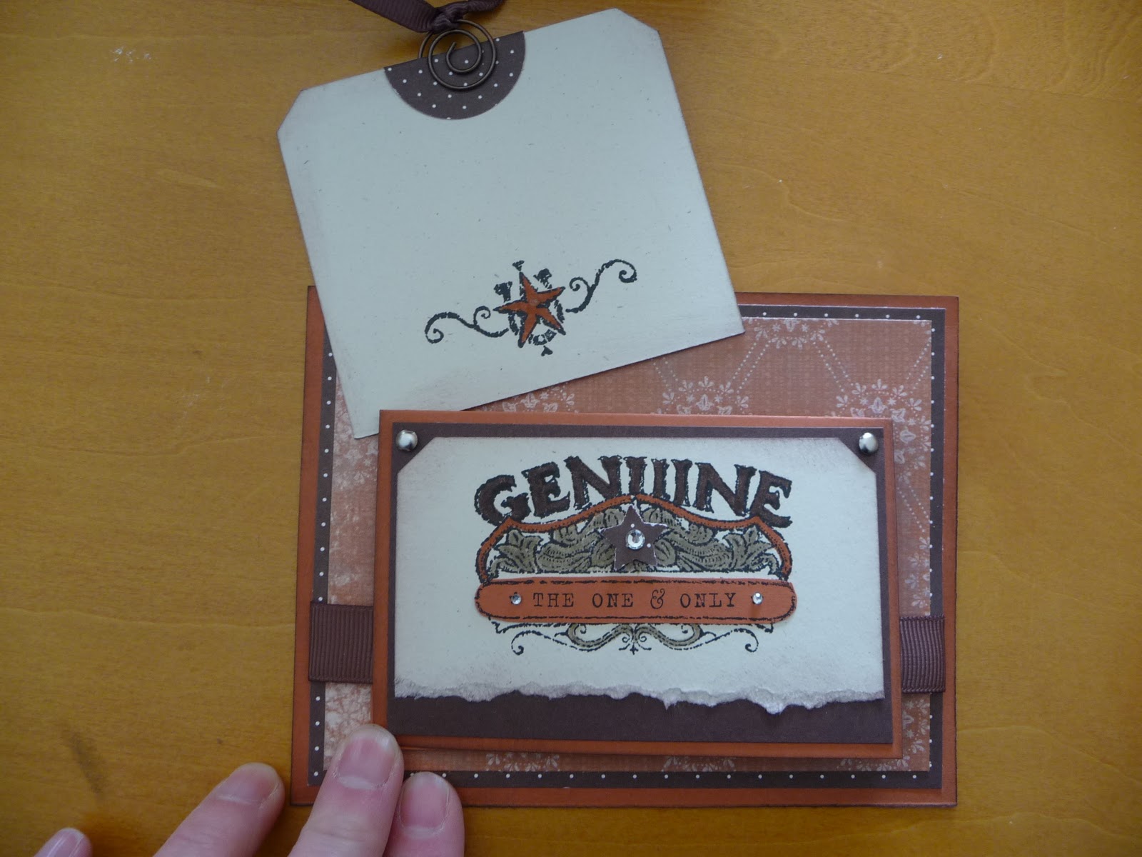
I love this card I designed.  Is that bragging?  It is really rare that I create something that knocks my own socks off.  I have been on a kick with small cards attached to larger ones, and this uses that same idea.  The whole card is just different.  I think it could work for a male or female as well. Okay, take a peek and then I'll give you some specifics.


edited to add suplly list since a few have asked! :-)
Stamp set: Bronc Buster, Afterthoughts (hostess from this catalog)
Inks: Stazon black, chocolate chip
Markers: Crumb cake, really rust, chocolate chip
Punches: Ticket corner, word window, star, 1 1/4 circle
Paper: Really rust, chocolate chip, natural ivory
DSP: Bella Rose, Simply scrappin kit Round up
Ribbon: 5/8" grossgrain chocolate chip, 1/4" grossgrain chocolate chip
Accessories: sponge, silver brads, aged copper hodgepodge hardware, basic rhinestones, dimensionals


This card is for a swap I do with other ladies using whatever SU supplies we have.  It is so much fun to get the swaps in the mail.  I am swapping with some talented ladies, and the fact that the items do not need to be current really opens up the surprises.  The set I used here is a retired set called Bronco Buster.  I really like western stuff.  The main card stock is Really Rust. Complementary colors are Chocolate Chip and Natural Ivory.  The details behind the star are colored with a Crumb Cake Marker, Chocolate Chip Marker and Really Rust Marker.  It is hard to see in the picture, but there is also some Chocolate chip sponging around all of the card stock edges.  A few Basic Rhinestones and the card just sparkles! See the tab at the top of the square?  It has the ribbon pull.  This is what is pulled out from behind the mini card.


Cute little place to write a note!  If a person wrote enough nice stuff on the tag, the recipient may end up using it as a book mark!  And finally the inside of the little card (which measures 5 1/2 x 4 1/4).


I used some retired Hodgepodge with the buckle and the spiral on the tag.  I just love the buckle on the inside!  The main piece of 5 1/2 x 4 1/4 Really Rust card stock does not open.  See!  A very different card!

Okay, now I need to find those socks I knocked off myself. :-)

Have a great day.  Thanks for sharing some of your time.  
Kristine 

Thursday, November 19, 2009

Side step glittery Christmas card


Although it took me some time to get the measurements right for this card, I like the end result! I added some dazzling diamonds to the "hills" to add that touch of bling I like so much. The tree image in the back is on a removable tag so a short Christmas message can be written. I think I might make make this my seasonal go to project. Can't you just see eggs on the steps and a cute bunny?