Pages

Thursday, April 7, 2011

Top Fold with an inside slider

Today's card is another card with a different fold for the opening.  It is a card I made for my Swap Group. 
(Side note: If you like making cards, and want to be a part of my Swap Group, please contact me.  We use SU only materials, but the materials do NOT have to be current.  It's a wonderful way to get usable cards for giving, and at the same time enjoy your hobby and share some of your own creativity and skill!)
Here is the front of the card...


Stamps: Perfect punches, Live like you mean it
Card stock: Close to Cocoa, Whisper white  DSP: ? I can't remember it's name!
Inks: Chocolate chip, blushing bride, Certainly Celery, Bashful blue
Ribbon: Blushing bride 1/2" poly twill
Punches: Decorative label, Wide oval, Curly label

Isn't it pretty!  A couple things I want to point out.  See that delicate edge on the blue stripe border?  I made that using the Curly Label Punch!  I LOVE it when a tool or stamp set can be used for more than its intended purpose!  More bang for the buck!

It's easy to make this border.  Draw a pencil line where you want the edge of the border to be.  Then line up the punch on the pencil line and punch!  I slipped my paper into the punch only about 1/4" .  Below is a sample of how I did the punching, but I'm using the Decorative Label Punch in this sample.  . 

As you can see, I used the points on the punch to line up against the pencil line.  I also used the Decorative Label Punch to mat my sentiment, which I think makes a nice continuity on the card front.  To open the card, the decorative lip lifts and... 

a little note, which is adhered under the ribbon, slides up!  The DSP makes the pocket for the slider note-card.  Cute huh?!  I copied this fold from a card that came from convention.  I thought it too clever!
 Thanks for sharing a few moments of your day Inking out loud with me. :-)
Kristine

Tuesday, March 29, 2011

Fungi for a fun guy

This is the second card that I had as a project at the Sale-a-Bration event this past March 19th.  It is a rather bold and bright card.  As a demonstrator, I feel that my customers should be able to see all of the colors used...not just my favorites! :-)  So I will, typically, at every event or workshop go in search of a card design that is something different than one I would design and add that card into the mix of what we will be making.  I found this card design on the Stampin' Up demonstrator website where all of the demos can upload photos and "steal" ideas from one another. Ilina Crouse is the demo who posted a card similar to this one.  I didn't have the exact DSP she used, but the idea/layout and stamp set are the same.   I think it such a cute card! 


A couple of things this card has that sold me...
1.  It uses turquoise...an often left out color in my cards.
2.  It could be used for either a male or female.  If it is for a male, on the inside of the card you can write a message that says something like, "You're such a fungi!" A horrible play on the words "Fun guy."  Men like those kind of puns...at least the men I know.  Baffles me.
3.  It showcases stamping with markers.
4.  Just by switching the DSP over and using a different image in the Funky Four Stamp set, you get a more feminine feel card with more muted colors.  See...

Stamps: funky four, Cute and curly
Card stock: So Saffron, Chocolate chip, Whisper white, Old olive, Play date Designer Paper
Inks: Old olive marker, Crumb cake marker, chocolate chip marker, So saffron marker, Tempting turquoise marker
Punches: Ribbon border, 1/16" handheld circle
Accessories: Subtles collection brads

The only bad thing about this card is the number of layers.  You can be sure I was grinding my teeth as I preped for the event.  80 card kits cut.  Each card has 12 pieces. (Two are hidden on the inside)  Do the math.  That is a gazillion pieces of card stock cut! But my cutter and I both held up!  We're both troopers.

Thanks for stopping in.  Next time you need to do more of the talking.  (ha! crack myself up!)
Kristine

Monday, March 28, 2011

Sweet Summer and a Tidy Tip

I recently helped to host a multi-demonstrator Sale-a-Bration event.  It was a lot of fun!  One of the cards that I had for the ladies to do used the Sweet Summer Sale-a-Bration set.  It is an outline set, which means it works well for coloring!  I used to love to color as a child.  I still do.  For awhile when my daughter was younger and all I ever colored were princesses from Disney, the love of coloring disappeared.  I enjoyed watching my daughter color, but could not muster the excitment to color one more ball gown.  But now that I'm back to coloring with wonderful Stampin' Up markers on my cards, the love has returned. Here's the card.

Stamps: Sweet Summer, Teeny Tiny Wishes
Embossing folder: Tulips
Card stock: Whisper white, Blushing Bride
Inks: Blushing Bride marker, Pear Pizazz  marker, Daffodil Delight marker, Stazon Jet Black
Ribbon: Blushing Bride Poly twill
Punches: Scallop Oval, Medium Oval

It's a super simple card, which is why I think it ended up being such a hit!  It is also the kind of card that will work for many occasions, I used one of the stamps from the set Teeny Tiny Wishes for the sentiment.  That brings me to today's Tidy Tip.  I have to admit that I am one of those people who likes everything neat and tidy.  I cannot create in chaos.  I must have all chores off my mind before I can settle into the right side of my brain.  So, something that was driving me ab-so-lute-ly NUTS was the stamp set Teeny Tiny wishes.  Love the set...hate how the blocks refused to stay neat and all standing up so I could easily read the sentiments.  Because this was the set I used at the Sale-a-Bration event, I spent a lot of time helping guests find a sentiment.  By the time I got home, I wanted to chuck the whole thing!  Urgh!  Then a thought dawned from my weary mind.  It said, "Make ledges."  It wasn't a voice like Kevin Costner hears in Field of Dreams, but I did hear it.  So I took a piece of scrap Window Sheet and began making mountain and valley folds.  Mountains were taped together and valleys were about 3/4" wide.  I then taped the valleys to my plastic case and placed my stamps into the valleys with the mountains becoming the ledges the stamps could rest against.  And it happened...that sigh escaped my lungs as I smiled and felt all neat and tidy!  Look!


Okay, it may not look like much, but those stamps do not slop around in the case anymore.  I can put a sentiment back exactly where I left it last.  No other stamp has slid into it's place or flopped over and messed up the arrangement.  And when I close the lid!!!...Yes... NOTHING changes. Makes me all emotional.  I tried to get a picture of the mountain and valley folds inside the case.  Dare I say this might just be genius!?


Just look how that line of stamps stays so soldierly on their ledge!  It's a little slice of heaven for a neat and tidy chic.

Okay, go tidy up your own Teeny Tiny Wishes.  You can thank me later. :-)
Kristine

Wednesday, March 16, 2011

The cards I'm sharing today are from my last workshop.  My hostess wanted an Easter card, so the following is what I came up with. 
The card uses a technique that I think is such a simple WOW called faux letterpress.  Using an embossing folder (in this case the Vintage wallpaper Embossing folder), you rub ink onto the folder on the side that is bumpless.  (Is that a word?)  Then place your card stock into the folder and run it through the Big Shot and the paper will be embossed, but the color you rubbed onto the folder will be laid down around the embossing.  It is just too cool!  I also found the very pretty ribbon technique on the Paper Crafters Sampler site and added that the center of the cross.  It looks hard, but it really is not.  Trust me...I'm all about being easy. (Okay, that didn't sound right, but you know what I mean.)  Then added to the center of that gor-jus ribbon is one of Stampin' Up!'s new Vanilla Rosettes.  Notice how I said vanilla, but mine isn't?  I'm too clever!  I daubered blushing bride ink onto the rosette to change its color!  Vanilla with white ribbon looks...well, puky.  So by adding color I get ahhhh, not eewwwehh.  Using Versamark ink I stamped the leaf image from the stamp set Just Believe onto the bottom.  I wanted the cross to stand out, so I didn't do any other stamping.  Now for the inside...

Using the same set, Just Believe, I used markers to color in the image and then stamped.  Pretty!  Isn't the sentiment perfect for Easter? :-) Yup!

Next up is a simple, elegant card which was inspired by a similar card designed by Sarah Wills.  Love her stuff.  Rich Razzleberry Satin Ribbon and ink on white.  Good combo! Three pearls from the Basic Pearls gives the butterfly a body. Look!


And finally another stamp you can earn free during Sale-a-bration called Tiny Teacup.  The colors remind me of a delicious cup of coffee.  This card is a direct CAS of Lisa Young. Isn't is wonderful?!  I think the Love Letters Designer paper and the Crumb Cake Seam Binding Ribbon are so complementary to each other.


That's it!

Here's a question for you...I have no idea how many readers I have out there in blog land.  I can see that there are some of you since my counter at the bottom of the page is going up, and that cannot possibly be just my mom and daughter and friends who kindly look at my cards!  So, the question...would it be helpful to you, my kind reader, if I include a recipe of my cards?  Leave me a comment.!  You have no idea how excited I get when I receive a comment. I do a little happy jig and SMILE!

Have a great day, and if the mood strikes you, do your own happy jig! 
Kristine


Friday, March 4, 2011

You're invited!

A couple of times a year, I get together with a group of Reno demonstrators and we host a day of stamping.  This year, the date for the event is March 19.  We have so much fun stamping!  The guests have a great time stamping as well as fun seeing each other.  If you'd like to join us for our Sale-A-Bration event, we still have space and we'd love to have you join us!  Even if you have a demonstrator already, we don't mind!  Come play.  There is a fee for the event which covers the 12 projects you will make, raffle prizes and refreshments.  It is a lovely afternoon spent in the company of like-minded paper crafters.  The event flier and registration is below.  Deadline for registration is March 12.  Just print the flier and send it to me to register.  My address is on the flier.  If you'd like to pay using paypal, just email me with your information and send payment to k-chubb@att.net in Paypal. 

Tuesday, March 1, 2011

Howdy!


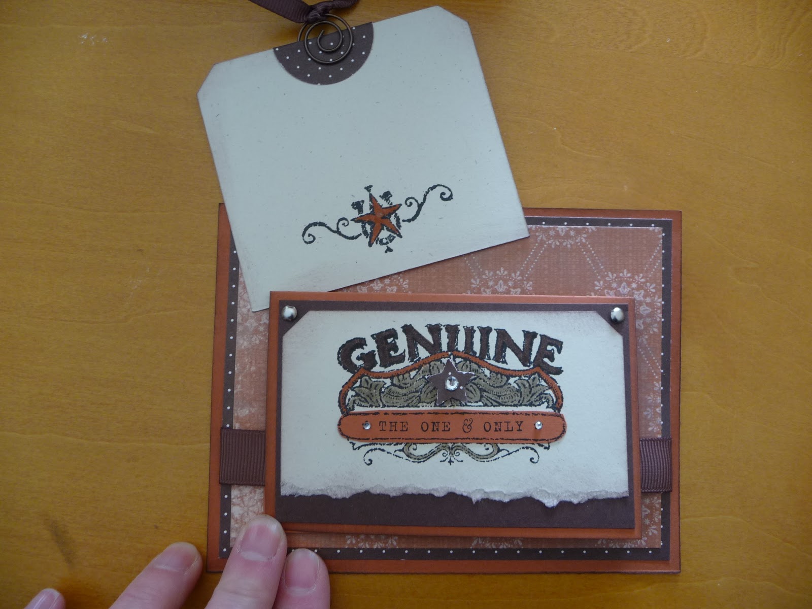
I love this card I designed.  Is that bragging?  It is really rare that I create something that knocks my own socks off.  I have been on a kick with small cards attached to larger ones, and this uses that same idea.  The whole card is just different.  I think it could work for a male or female as well. Okay, take a peek and then I'll give you some specifics.


edited to add suplly list since a few have asked! :-)
Stamp set: Bronc Buster, Afterthoughts (hostess from this catalog)
Inks: Stazon black, chocolate chip
Markers: Crumb cake, really rust, chocolate chip
Punches: Ticket corner, word window, star, 1 1/4 circle
Paper: Really rust, chocolate chip, natural ivory
DSP: Bella Rose, Simply scrappin kit Round up
Ribbon: 5/8" grossgrain chocolate chip, 1/4" grossgrain chocolate chip
Accessories: sponge, silver brads, aged copper hodgepodge hardware, basic rhinestones, dimensionals


This card is for a swap I do with other ladies using whatever SU supplies we have.  It is so much fun to get the swaps in the mail.  I am swapping with some talented ladies, and the fact that the items do not need to be current really opens up the surprises.  The set I used here is a retired set called Bronco Buster.  I really like western stuff.  The main card stock is Really Rust. Complementary colors are Chocolate Chip and Natural Ivory.  The details behind the star are colored with a Crumb Cake Marker, Chocolate Chip Marker and Really Rust Marker.  It is hard to see in the picture, but there is also some Chocolate chip sponging around all of the card stock edges.  A few Basic Rhinestones and the card just sparkles! See the tab at the top of the square?  It has the ribbon pull.  This is what is pulled out from behind the mini card.


Cute little place to write a note!  If a person wrote enough nice stuff on the tag, the recipient may end up using it as a book mark!  And finally the inside of the little card (which measures 5 1/2 x 4 1/4).


I used some retired Hodgepodge with the buckle and the spiral on the tag.  I just love the buckle on the inside!  The main piece of 5 1/2 x 4 1/4 Really Rust card stock does not open.  See!  A very different card!

Okay, now I need to find those socks I knocked off myself. :-)

Have a great day.  Thanks for sharing some of your time.  
Kristine 

Tuesday, February 22, 2011

A Party!

This past weekend I had a birthday card class at my home.  We made two each of four designs. All of the cards use the Occasions Mini set Bring on the Cake.  A set that is well worth its price. 

Despite the mounds of snow, and the cold, lots of stampers came and joined me in the class.  It was a wonderful day!  In the picture below, I am ready to party.  All the paper mugs are waiting for their guests.  My daughter had the best time deciding where each mug should sit.


Then the ladies arrived and we got busy stamping!


The first card is a different fold.  I not only used just one stamp set for this class, but for all but one card, the DSP came from the Play Date DSP pack.  I really like the subtle pattern on this Old Olive piece of DSP.


And this is how the card opens!


The next card is the "masculine" card of the set.  It is a CAS from another demonstrator (whose name I cannot find at the moment, but will hunt down!)  Edited 3/28/11: The original designer of the card below is Michele Reynolds! Mine is a bit different than hers.


The next two cards are CASEs from the Stampin Doc. 


Thanks for stopping by. 
Kristine