Pages

Wednesday, March 16, 2011

The cards I'm sharing today are from my last workshop.  My hostess wanted an Easter card, so the following is what I came up with. 
The card uses a technique that I think is such a simple WOW called faux letterpress.  Using an embossing folder (in this case the Vintage wallpaper Embossing folder), you rub ink onto the folder on the side that is bumpless.  (Is that a word?)  Then place your card stock into the folder and run it through the Big Shot and the paper will be embossed, but the color you rubbed onto the folder will be laid down around the embossing.  It is just too cool!  I also found the very pretty ribbon technique on the Paper Crafters Sampler site and added that the center of the cross.  It looks hard, but it really is not.  Trust me...I'm all about being easy. (Okay, that didn't sound right, but you know what I mean.)  Then added to the center of that gor-jus ribbon is one of Stampin' Up!'s new Vanilla Rosettes.  Notice how I said vanilla, but mine isn't?  I'm too clever!  I daubered blushing bride ink onto the rosette to change its color!  Vanilla with white ribbon looks...well, puky.  So by adding color I get ahhhh, not eewwwehh.  Using Versamark ink I stamped the leaf image from the stamp set Just Believe onto the bottom.  I wanted the cross to stand out, so I didn't do any other stamping.  Now for the inside...

Using the same set, Just Believe, I used markers to color in the image and then stamped.  Pretty!  Isn't the sentiment perfect for Easter? :-) Yup!

Next up is a simple, elegant card which was inspired by a similar card designed by Sarah Wills.  Love her stuff.  Rich Razzleberry Satin Ribbon and ink on white.  Good combo! Three pearls from the Basic Pearls gives the butterfly a body. Look!


And finally another stamp you can earn free during Sale-a-bration called Tiny Teacup.  The colors remind me of a delicious cup of coffee.  This card is a direct CAS of Lisa Young. Isn't is wonderful?!  I think the Love Letters Designer paper and the Crumb Cake Seam Binding Ribbon are so complementary to each other.


That's it!

Here's a question for you...I have no idea how many readers I have out there in blog land.  I can see that there are some of you since my counter at the bottom of the page is going up, and that cannot possibly be just my mom and daughter and friends who kindly look at my cards!  So, the question...would it be helpful to you, my kind reader, if I include a recipe of my cards?  Leave me a comment.!  You have no idea how excited I get when I receive a comment. I do a little happy jig and SMILE!

Have a great day, and if the mood strikes you, do your own happy jig! 
Kristine


Friday, March 4, 2011

You're invited!

A couple of times a year, I get together with a group of Reno demonstrators and we host a day of stamping.  This year, the date for the event is March 19.  We have so much fun stamping!  The guests have a great time stamping as well as fun seeing each other.  If you'd like to join us for our Sale-A-Bration event, we still have space and we'd love to have you join us!  Even if you have a demonstrator already, we don't mind!  Come play.  There is a fee for the event which covers the 12 projects you will make, raffle prizes and refreshments.  It is a lovely afternoon spent in the company of like-minded paper crafters.  The event flier and registration is below.  Deadline for registration is March 12.  Just print the flier and send it to me to register.  My address is on the flier.  If you'd like to pay using paypal, just email me with your information and send payment to k-chubb@att.net in Paypal. 

Tuesday, March 1, 2011

Howdy!


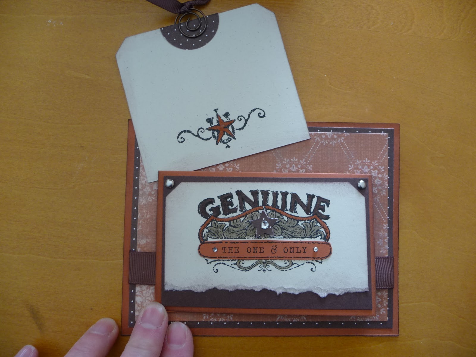
I love this card I designed.  Is that bragging?  It is really rare that I create something that knocks my own socks off.  I have been on a kick with small cards attached to larger ones, and this uses that same idea.  The whole card is just different.  I think it could work for a male or female as well. Okay, take a peek and then I'll give you some specifics.


edited to add suplly list since a few have asked! :-)
Stamp set: Bronc Buster, Afterthoughts (hostess from this catalog)
Inks: Stazon black, chocolate chip
Markers: Crumb cake, really rust, chocolate chip
Punches: Ticket corner, word window, star, 1 1/4 circle
Paper: Really rust, chocolate chip, natural ivory
DSP: Bella Rose, Simply scrappin kit Round up
Ribbon: 5/8" grossgrain chocolate chip, 1/4" grossgrain chocolate chip
Accessories: sponge, silver brads, aged copper hodgepodge hardware, basic rhinestones, dimensionals


This card is for a swap I do with other ladies using whatever SU supplies we have.  It is so much fun to get the swaps in the mail.  I am swapping with some talented ladies, and the fact that the items do not need to be current really opens up the surprises.  The set I used here is a retired set called Bronco Buster.  I really like western stuff.  The main card stock is Really Rust. Complementary colors are Chocolate Chip and Natural Ivory.  The details behind the star are colored with a Crumb Cake Marker, Chocolate Chip Marker and Really Rust Marker.  It is hard to see in the picture, but there is also some Chocolate chip sponging around all of the card stock edges.  A few Basic Rhinestones and the card just sparkles! See the tab at the top of the square?  It has the ribbon pull.  This is what is pulled out from behind the mini card.


Cute little place to write a note!  If a person wrote enough nice stuff on the tag, the recipient may end up using it as a book mark!  And finally the inside of the little card (which measures 5 1/2 x 4 1/4).


I used some retired Hodgepodge with the buckle and the spiral on the tag.  I just love the buckle on the inside!  The main piece of 5 1/2 x 4 1/4 Really Rust card stock does not open.  See!  A very different card!

Okay, now I need to find those socks I knocked off myself. :-)

Have a great day.  Thanks for sharing some of your time.  
Kristine 

Tuesday, February 22, 2011

A Party!

This past weekend I had a birthday card class at my home.  We made two each of four designs. All of the cards use the Occasions Mini set Bring on the Cake.  A set that is well worth its price. 

Despite the mounds of snow, and the cold, lots of stampers came and joined me in the class.  It was a wonderful day!  In the picture below, I am ready to party.  All the paper mugs are waiting for their guests.  My daughter had the best time deciding where each mug should sit.


Then the ladies arrived and we got busy stamping!


The first card is a different fold.  I not only used just one stamp set for this class, but for all but one card, the DSP came from the Play Date DSP pack.  I really like the subtle pattern on this Old Olive piece of DSP.


And this is how the card opens!


The next card is the "masculine" card of the set.  It is a CAS from another demonstrator (whose name I cannot find at the moment, but will hunt down!)  Edited 3/28/11: The original designer of the card below is Michele Reynolds! Mine is a bit different than hers.


The next two cards are CASEs from the Stampin Doc. 


Thanks for stopping by. 
Kristine


Tuesday, February 15, 2011

Cheers!


I have a class this coming Friday.  I wanted to give little, fun gifts to my guests.  So I decided to make paper mugs!  The original idea came from a fellow blogger, Lisa Young.  She is wonderful, and provided instructions for the cup.  I have gads of DSP, so I picked bright colors and started cutting and assembling...and cutting and assembling...and cutting and assembling...and I realized that I had undertaken (again) a project that did not seem so large in the inception, but got a bit overwhelming in the production.  But I am pleased with the results.  The mugs will not hold water--being that they're made of paper!--but they are the perfect containers for chocolate!!  The tube sticking out of each cup is rolled waxed paper.  Did you know that to keep your punches working well, every so often punch them through some heavy tin foil followed by wax paper?  The foil "sharpens" and the wax paper "oils."  Nifty huh!  Most ladies have foil on hand, but not all have wax paper in the cabinet.  I think the rolls look a bit like a straw sticking out of the cup.  I'll go with that.  In fact, would you believe I planned that?  No?  Me neither.  Have a look!


And a close up...
The tag is made with the Scallop Oval Punch, the Small Oval Punch.  The sentiment is from the Occasions Mini set You're a Gem--a fave of mine from this mini.


And a sampling...


I can't wait to see the project tables set with all the mugs!  If you're coming to class, act surprised when you see them. :-)

Remember to be grateful for all your blessings.  Thanks for sharing some time today with me.
Kristine

Tuesday, February 8, 2011

On the softer side


Happy Tuesday morning to you!  Today I am in a funk.  Ever have those days?  Just cannot get the rear in gear! Fortunately, I am ready to post some more cards for you!

The first uses the watercolor roses technique shown to me by my friend, Lynnette.  She's a talented lady! (Shame, shame shame she does not have a blog we can all oogle. Sigh)  Using an aqua painter and some reinker, you float the color on top of glossy or shimmer paper and let it dry.  I used So Saffron and Peach Parfait reinkers because, as Donkey says in Shrek, "Everybody like Parfait!." I used that wonderful flourish from the set Baroque Motifs (may it never retire) and the rose image from Fifth Avenue Floral.  The leaves of the rose are punched from the wing of the Two step bird punch

 "Ahhh!" you say, "What a versatile punch!"
  "Yes," I answer wisely, nodding my head, "It is not just for the birds!"  hahahahaha 
 Okay, add ramie to that funky thing I got goin'.  With a Polka Dot dry emboss on the Peach Parfait panel (again, because "Everybody like Parfait!")  and a vanilla Top Note, the card has a Victorian feel.  Yes?
 
"But, Kristine...how did you make those bird wings look like such realistic leaves?" 
I blush, smile and say, "It's easy!  Punch out the wing from Pear Pizzazz card stock.  Then crumple it 'til it's tiny, tiny.  Then uncrumple it and press it against a Pear Pizzazz classic ink pad.  The ink fills in the crumples and makes it look great!" 
You smile at me and we are both happy to know how to make leaves from bird wings.  I only wish I could press myself up against a classic ink pad and make my "crumples" look great. {sigh}  Basic pearls in the swirls of the flourish, some Victoria Crochet ribbon and a pretty font in the sentiment from Fabulous Phrases finish off the card.  Okay, you now get to look!


Next up is a direct CAS card from Mary Fish.  She is becoming my idol.  Love her stuff!  This card uses the Rub-ons from the Occasions Mini called Love Impressions.  An aside: Have you ever stopped to think that there is someone,( maybe multiple someones!) whose job it is to name the stuff in the catalog!  Hmmm, guess that would take a talent for alliteration or maybe just a need to control the world and name things?  Anyway, moving on....The card is framed with the pretty Tulip Embossing folder.  Simple black, red and white with a touch of pink keep it simple.  Not an ounce of ink is used on this card!  I suppose this isn't a stamped card, technically.  It's a rubbed card!  No inky fingers.


And the final card.  Thank you for reading this far.  My... you're a saint. 

This card uses Lap of Luxury DSP and the Square Lattice Embossing folder.  To get the look of a quilt, first layer all pieces and then run the whole thing through the Big Shot with the embossing folder.  It squishes (a very technical stamping term) all the layers together and it looks very "quilty."  The sentiment is from the Occasions set You're a Gem.  And really...YOU'RE a gem if you read my whole post today.  Gracias!

Tuesday, February 1, 2011

Best wishes


Sometimes the color orange suits me.  Not often, but sometimes.  This is a card I CASED from a past Stampin' Up! catalog.  There's a reason the catalogs are called "Idea Books!" lol  One of the things I would not have thought to do on my own is to lay strips of DSP down a card.  No matting, no frills, just strips.  I made this card for a swap, and I hope the ladies like it.  Do you?  (hint hint...leave a comment :-))The front flower is cut out and popped up on a couple of dimensionals.  I enjoy cutting things out.  It's almost a meditation for me.  I just watch my scissors snip and turn and pretty soon I'm soooo peaceful.  I didn't mind cutting out a bunch of these!  You know what else?  I like this photograph!  The card actually looks like the card IRL! Imagine that.  Might this mean my photography skills are improving?  Nahhh. Luck. ;-)

Thanks for popping in today.  I've listed a recipe after the picture. I hope you find some time to make something today, be it a card a scrapbook page, or a pan of brownies! Yum.


Stamps: Kind and caring thoughts (retired)
Ink: Tangerine Tango, Old Olive
Cardstock: Old Olive, Tangerine tango, Whisper white
Designer paper: Haiku (retired)